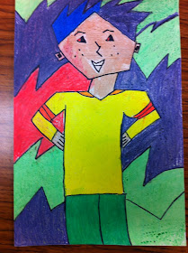
This is another Pinterest find this summer, for Positive/Negative space. The first day we painted a 4 1/2 by 7" paper with black acrylic paint, and before it dried we brushed on silver metallic paint. Day 2, we used a wet on wet watercolor method for the background, periodically spraying the paper to keep it moist. We used a combination of Crayola water colors and liquid water colors. Before we were done with the watercolor paper, we also added liquid metallic watercolors as well. Day 3, the students turned the black paper to the back and drew out shapes on the perimeter of the rectangle. Once this was done and I checked them (this had to be done to make sure the kids weren't drawing shapes on the corners where it was touching two sides), they could start cutting out their shapes. After the shapes were cut, we glued the large black piece down and arranged and glued one side at a time. This project took 4 days in all to complete with my 4th graders.
Monday, November 25, 2013
Friday, November 22, 2013
Stamped City and My Opinion on Crayola vs. Prang Water Colors
Stamped city is a project that deals with space, I think I saw this years ago at a Texas Conference. Overlapping is encouraged to help create depth in the picture. The outline of the buildings are "stamped" with pieces of cardboard of different sizes. We used construction paper crayons to outline the buildings and then water colored the rest. Now, I know that many people lean to using the Prang water color sets. I myself like the brightness and more translucent look of the Crayola brand. Prang definitely has its place, if I want a darker more opaque look, which can quickly ruin a picture if the kids don't control the paint, in my opinion. Hard to help a class of 29 kindergardeners in a 50 minute class time to make sure they aren't over doing it! (Ha, that is just funny, using the word control in the same sentence with 29 kindergartners!) Almost every time I decide to use Prang I find myself regretting that I didn't use Crayola. I just feel that overall the kids are more successful with Crayola water colors. Yes, Prang has a better brush, I save the brushes from Prang and use with Crayola, problem solved. The one thing I can say that I wish Crayola would adopt from Prang is the removable ovals. I hate discarding the set because the blue is gone, it is ALWAYS the blue. Maybe just add in an additional blue oval, or make the blue BIGGER! Am I the only Crayola groupie?? (Hehe)
Monday, November 18, 2013
Cubist Portraits
The cubism styled portraits are always a super cute project. I love them, because portraits can be very challenging, and I find that many students get "stuck" when doing realistic styled portraits. The perfectionist group always has a hard time with portraits, unless we are doing cubism style. We, of course, talk about Pablo Picasso and his role in making the style popular. We discuss that cubism is about the imperfections that make it look unique. And of course that sometimes the mistakes are the best part of these pictures. This project is a 3 class project. Day one, draw out the person and background. Sharpie can be started if time allows. Day 2, finish sharpie and start adding color with crayon. I have them color their person and part of the background. Day 3, finish coloring and apply watercolor as a resist project. This project was done with 3rd grade.
Friday, November 15, 2013
Water Lilies
This is the other design the 5th graders could choose from when we were working on organic shapes. Both the background and water lilies are done with painted paper and embellished with art sticks and colored pencils. This project took one class to paint the papers. One class period to cut out, design, arrange and glue them. And then, a 3rd day to complete the water scene with water ripples, flowers and vines.
Monday, November 11, 2013
Poppies
My 5th graders are working on organic shapes. They actually get the choice of one of two designs. The poppy picture or water lilies, which I will be sharing soon. The back ground is painted paper, where we use a scraping method with pressed cardboard. The poppies themselves are also painted paper. The flowers are detailed with a large black sharpie and yellow art sticks. After the stems and leaves are drawn, they use green 3-D paint to detail. This project took one class to paint paper, and another class to finish the poppy art.
Tuesday, November 5, 2013
Indian Headdress
What do you think of when you say Native American or Indian? Do you think of a headdress?
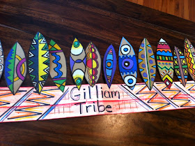
There are many different styles of headdress adapted by different tribes. The Sioux Indians wore the most traditional headdress. Only the brave warriors wore them. And actually, each feather was earned through brave acts. In the beginning, a young warrior would collect his feathers on a pole and use it for special occasions. Once a warrior earned enough feathers, he and his closest friends would bind the feathers into an original headdress.
I decided that teachers are much like warriors. We work late hours. We worry about our "tribes". Are students are at the heart of every decision we make. So, I had each of my fourth grade classes make a band with their teacher's name. They had the freedom of decorating however they wanted. They also made an original design for their feather. Each feather was made of brown craft paper, once the pencil design was completed they used large black sharpies to outline. Then, color pencil and art sticks were used to color in the design. Each child attached their feather onto the "tribes" head band to complete the headdress look.


